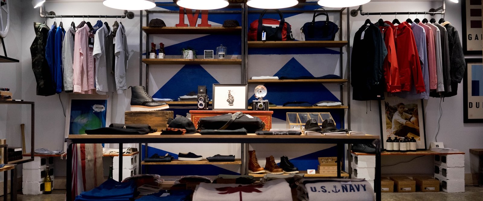
E-commerce redesign for a clothing store
A full overhaul of the shopping experience: a streamlined checkout, mobile-first navigation and dynamic filters to cut abandonment and lift conversion.
The challenge
A clothing e-commerce store came to us with a low conversion rate and high cart abandonment, and the diagnosis pointed to clear problems, such as a 5-step checkout that created friction, confusing navigation on mobile and a filter system that made products hard to find.
Cart abandonment reached 78% and most traffic, some 65%, came from mobile, where the experience was especially poor, so the goal was to redesign the entire shopping experience to cut friction and turn visitors into buyers.
Our approach
We analyzed the full conversion funnel to pinpoint where buyers dropped off and checkout turned out to be the most critical point, with 5 steps and redundant forms that drove mass abandonment, while on mobile browsing by category made it hard to filter efficiently.
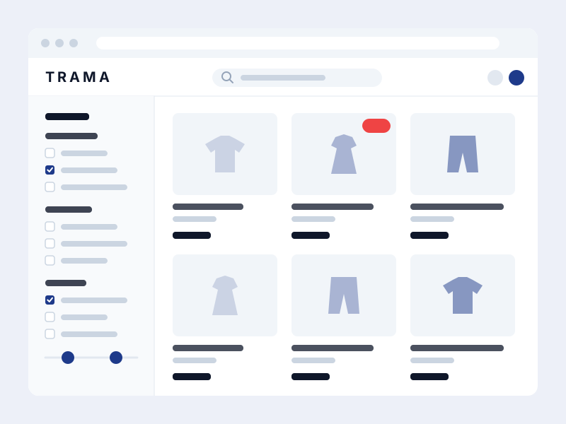
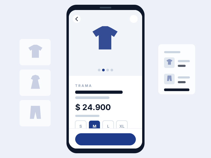
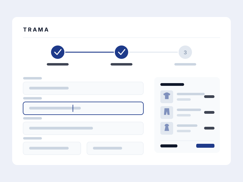
The strategy was to cut friction at every step, so we consolidated checkout from 5 steps to 3, added dynamic filters that update in real time and rebuilt product pages for mobile with native gestures, swiping for colors and scrolling horizontally for sizes.
How the store turned out
The full shopping journey redesigned, from catalogue to payment, focused on what happens on the phone.
Projected metrics
Payment went from five screens to three by removing mandatory sign-up and merging shipping and billing details into a single stage.
Redesigning for the small screen first put buttons and forms where the thumb reaches, which is exactly where the purchase used to fall apart.
We optimised the catalogue photos, which were slowing browsing down at the very moment of comparing products.
Size, colour and category filters combine without reloading the page, so finding something specific stopped being a blind search.
Got a project in mind?
Tell us what you need and we'll reply by email, no strings attached.
Or email us at contacto@teslerlab.com