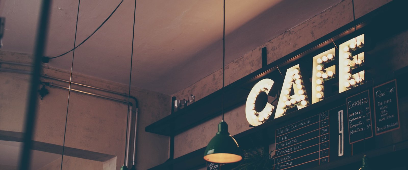
Visual identity for a specialty coffee shop
Full brand development for a new specialty coffee shop, from strategy through to final applications, with an identity that conveys craft and warmth.
The challenge
A new specialty coffee shop needed to position itself as a premium brand without coming across as exclusive or out of reach, so the goal was to build a visual identity that conveyed craft, warmth and a real knowledge of coffee and appealed to connoisseurs and the curious alike.
The brand had to work across many touchpoints, from in-store signage to social media, packaging and the menu, and all of it held together by a coherent visual system that felt authentic and approachable.
Our approach
The key to this project was striking a balance between craft and modernity, because the shop wanted to look premium without being exclusive, approachable for the neighborhood but with the visual quality of the big specialty brands.
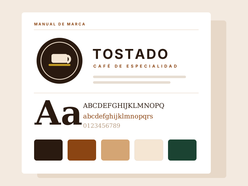
We worked with a palette drawn from the natural tones of coffee, from dark espresso to milk foam, and chose a serif for headings that reinforces the artisanal character while the sans-serif for body text keeps things legible and modern.
How the identity turned out
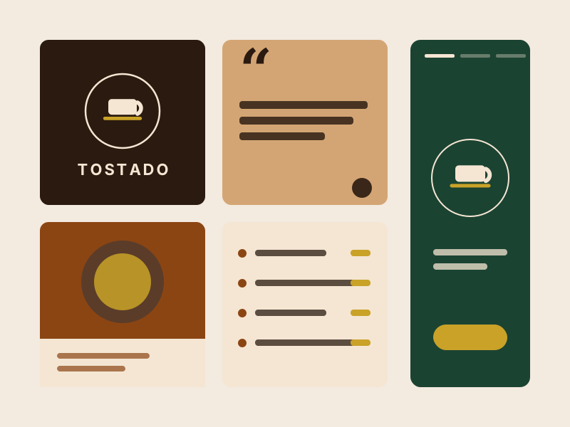
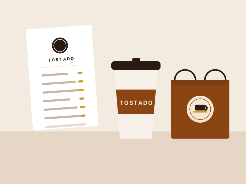
The complete system as delivered: the brand, its palette, the typography and the pieces where it lives every day.
Visual system
A palette drawn from the natural tones of coffee, paired with a two-tier type system that brings the artisanal together with the functional.
- Playfair Display
Serif typeface for headings and standout elements, conveying warmth, tradition and a handcrafted character.
- Inter
Clean sans-serif for body copy, menu and digital communication, with an eye on legibility and modernity.
Deliverable in numbers
Beyond the main logo there are six versions for different uses, from the small stamp on the cup to the extended mark on the shopfront.
Two main tones and three supporting ones, with their print and screen codes, so the colour looks the same on packaging and on Instagram.
The manual documents correct usage, clear space and mistakes to avoid, so the brand stays the same when someone else applies it.
We delivered material ready to use across menu, packaging, signage and social templates, with no need to come back to the studio to publish.
Got a project in mind?
Tell us what you need and we'll reply by email, no strings attached.
Or email us at contacto@teslerlab.com