
Landing page for an accounting firm
We designed and built a professional landing page for an accounting firm that needed a digital presence, a site that conveys trust and inquiries that don't depend on word of mouth.
The challenge
The accounting firm operated entirely through personal referrals and had no web presence at all, which in a market where prospective clients look up professionals on Google before deciding left it at a real competitive disadvantage.
They needed a site that conveyed trust and professional solidity, presented their services clearly, and worked as a channel for organic inquiries without relying solely on word of mouth.
Our approach
The accounting field has a perception problem, because many firms look the same online, so our strategy was to stand out through visual trust with a dark navy palette and gold accents that convey seriousness and experience without feeling dated.
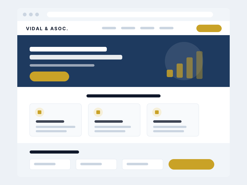
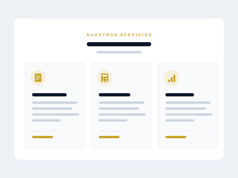
The landing page was structured like a funnel: a clear value proposition up top, specific services in the middle and a simplified contact form at the bottom. Each section answers a visitor objection so that, by the time they reach the form, getting in touch feels like the natural next step.
How the landing page turned out
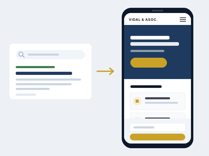
A single page that organises the firm's offer and leads to the form, designed for the phone first.
Landing page design
Design decisions
Every visual decision was made with a clear strategic goal: building trust in a field where credibility is the main driver of conversion.
- Navy + gold palette
The dark blue conveys seriousness and institutional trust, while gold as an accent reinforces the sense of a premium, distinctive service.
- Serif type for headings
Serif headings evoke tradition and professional solidity, core values for an established accounting firm.
- Clean, direct layout
A single-column structure with generous spacing, where each section guides the visitor toward getting in touch with no distractions.
Projected metrics
Optimised images and light code make the page appear almost instantly, which matters when the visit arrives on a phone over mobile data.
Semantic structure, metadata and structured data left the site ready for Google to understand and rank it from day one.
The design starts on the small screen and grows towards desktop, so content is never cramped and nobody has to zoom in.
We ask only for what is needed to reply to an enquiry, because every extra field is an enquiry lost before it is sent.
Got a project in mind?
Tell us what you need and we'll reply by email, no strings attached.
Or email us at contacto@teslerlab.com