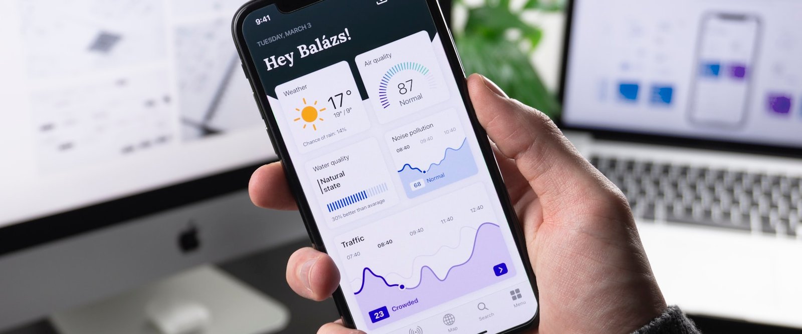
Design system for a fintech startup
We built a complete design system for an early-stage fintech: visual identity, color palette, UI components and interactive prototypes ready for development.
The challenge
A new fintech needed to convey security and modernity from a user's very first contact, although it had no defined visual identity and no component system its dev team could implement consistently.
The technical team needed clear specs, with design tokens, documented component variants and prototypes that acted as a single source of truth, because without that each developer made visual decisions on their own and the interface piled up inconsistencies.
Our goal was to build a complete design system that solved both problems at once, with a visual identity that inspires trust and a component kit that speeds up development.
Our approach
A fintech faces a design challenge of its own, because it has to convey the security of a bank and at the same time the accessibility and modernity of an app, so striking that balance was our priority from day one.
We decided to build the design system before prototyping any screen, which let us define the palette, typography, components and interaction patterns as one coherent language the dev team could implement without ambiguity, with each component designed across 3 breakpoints and documented with tokens.
How the system turned out
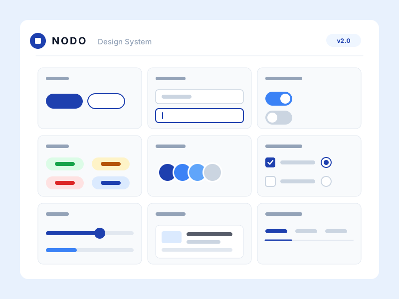
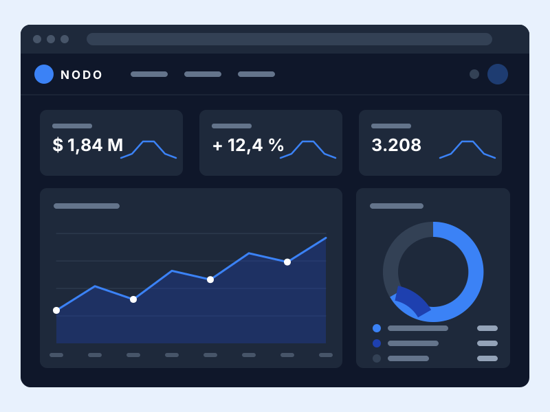
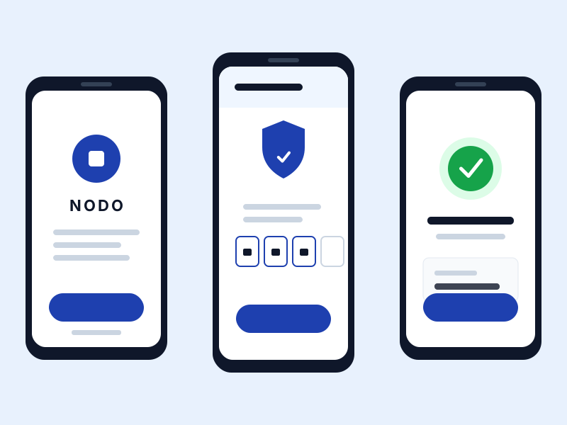
The component library and the screens that use it, delivered in Figma and ready for development to implement.
Color palette
A palette that conveys financial trust, where the deep blues communicate institutional security while the lighter tones bring modernity and accessibility.
- Navy (#0F172A)
Sidebar, headers, main text
- Blue (#1E40AF)
Primary buttons, links, accents
- Ice (#F0F9FF)
Backgrounds, surfaces, hover states
Design system components
Each component was designed with clear variants, documented interactive states and consistent spacing tokens.
- Buttons
Primary, Secondary, Danger, Disabled
- Text field
Label, helper text and format validation documented for every state
- Status badges
Approved, Pending, Rejected, In progress
- Metric card
A highlighted number with its label, like the user's available balance
Deliverable in numbers
Buttons, fields, badges and cards were defined once, so every new screen is assembled from pieces instead of drawn from scratch.
The prototype covers the product's core flows, from sign-up to daily operation, navigable as if it were already built.
Colour, type and spacing live as named tokens, so a brand change propagates without touching screen by screen.
Every component has its behaviour resolved on phone, tablet and desktop, so the technical team does not improvise the adaptation.
Got a project in mind?
Tell us what you need and we'll reply by email, no strings attached.
Or email us at contacto@teslerlab.com